
How much text on App Store screenshots? 3-6 words
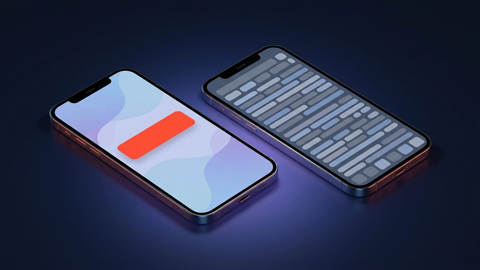
"How much text should go on an App Store screenshot?" is the wrong question only because of how it's usually answered — with a number pulled from nowhere. The honest answer is a range with a reason behind it. The reason is how people actually look at a product page, and once you've seen that, the word count almost picks itself.
This post is specifically about length and quantity of text — how many words a caption can carry before it stops working. It deliberately doesn't cover what those words should say, how to phrase a benefit, or how to order your panels. That craft is its own topic, and we wrote it up separately in App Store screenshot captions that convert. Read this one for the budget; read that one for the writing.
People decide fast, and most don't scroll
Two behaviours drive everything about caption length. First, the install decision happens quickly — commonly cited research puts it around five to seven seconds on the product page. Second, most users never scroll past the first two or three screenshots. The exact percentages vary by source and by app category — you'll see figures like "90% don't scroll past the third" or "only ~9% view them all" — so treat them as directional rather than gospel. But the direction is consistent across every credible study: the first few panels carry almost all of the weight, and they get a glance, not a read.
A glance is the operative word. In that first pass, nobody is reading sentences. They're parsing shape, contrast, the device, and a few large words. If your caption can't be absorbed in that glance, it isn't being absorbed at all — it's decoration that happens to be made of letters.
The 3-6 word rule
The practical sweet spot is a single benefit-led line of roughly three to six words per screenshot. Some of the strongest captions are even shorter — one to four words. The rule isn't magic; it's the longest a phrase can be while still reading as one idea at a glance instead of a sentence you have to process.
What "benefit-led" buys you inside that budget:
- "Track workouts effortlessly" beats "A workout tracking app" — same length, but one names the payoff and the other names the category.
- "Split bills in seconds" beats "Expense splitting with multi-currency support and receipt scanning" — the second is a feature list wearing a caption's clothes.
- "Your day, planned for you" beats "AI-powered intelligent scheduling assistant" — five plain words land faster than three jargon words.
Notice none of those examples are about being clever. They're about fitting one clear idea into a space the reader will actually look at. The 3-6 word count is a constraint that forces the prioritisation: with six words you get exactly one promise per screenshot, which is the right number.
The real test is readability at thumbnail size
Here's the part most people skip. Your caption doesn't first appear at full size — it appears as a thumbnail in search results and in the "You Might Also Like" rows, scaled down to a fraction of the export resolution. If it's illegible there, the length question is academic, because the user never gets to the full-size version.
So the test isn't "does this fit?" It's the squint test:
- Design captions large. Roughly 60pt or bigger at export resolution is a common floor. Big type and few words are the same decision.
- Shrink the canvas to thumbnail size and squint. If you can't read the caption in a half-second blur, it's too long, too small, or too low-contrast.
- Watch contrast, not just size. Light grey text on a pale gradient fails the squint test even at six words. Caption legibility is type size × contrast, and a short caption wins on both.
This is the mechanical reason short captions outperform — not because brevity is a virtue in the abstract, but because a 3-6 word line can be set large enough to survive being shrunk, and a paragraph cannot.
Per-category nuance: games vs utilities
The 3-6 word rule is a default, not a law, and the main place it bends is between categories.
Utilities, productivity, and finance apps are chosen on features and function. Users are comparing capabilities, so a clear functional benefit per panel — one feature, one caption — is exactly right. Portrait layouts that mirror real usage tend to win here, and the 3-6 word benefit line is the sharpest tool you have.
Games are chosen on experience and emotion, not feature comparison. The screenshot is doing more visual work — gameplay, character art, world — and the caption is often even shorter, sometimes just a mood word, because the image is the message. Landscape and gameplay-forward stills frequently outperform pure marketing art. If anything, games push you below the 3-6 word range, not above it.
Either way, the direction holds: the more the image carries, the less the caption needs to. Nothing in either category argues for more words.
What to avoid
Almost every caption mistake is a length mistake in disguise:
- Paragraphs. If your caption has a comma and a clause after it, it's a sentence, and sentences don't get read in a glance. Cut it to the one idea that matters.
- Feature lists. Three bullet points stacked on one screenshot read as zero benefits, because the eye doesn't pick one. One panel, one promise.
- Restating the category. "A photo editing app" wastes the whole caption telling people what the icon and title already told them.
- Jargon to sound advanced. A caption stuffed with corporate buzzwords reads slower than plain benefit copy; "Get it done faster" beats any three-syllable abstraction at thumbnail size.
- Tiny text to fit more. If you're shrinking the type to make the words fit, the words don't fit. Cut words, not point size.
Where this fits with caption craft
Length is one dial; what you actually write is another. This post deliberately stays on the length dial — the 3-6 word budget, thumbnail legibility, the games-vs-utilities split. For the writing itself — choosing the benefit, sequencing your panels into a story, A/B-testing the wording — the companion piece does that work: App Store screenshot captions that convert. And for the full production checklist around dimensions, frames, and submission, see App Store screenshot best practices for 2026.
How Mokbi helps with the length problem
Hitting the 3-6 word target is partly a writing problem, and writing tight benefit lines under a word budget is genuinely hard. Mokbi's AI Studio generates short, benefit-led headline options you can drop straight onto a panel — useful as a starting point when you're staring at a blank caption, not a replacement for your own judgement about what's true of your app. You stay in control of the wording; the generator just gets you past the blank-line stage faster. And because Mokbi is built for App Store and Play screenshots specifically, the caption type sizes default to something that survives the squint test, and one-click translation carries your short captions into 50 languages without you re-solving the length problem per locale. Designing is free; a subscription (Solo €29.99/mo or Studio €49.99/mo) unlocks export and publishing.