
Games vs utilities: App Store screenshot patterns
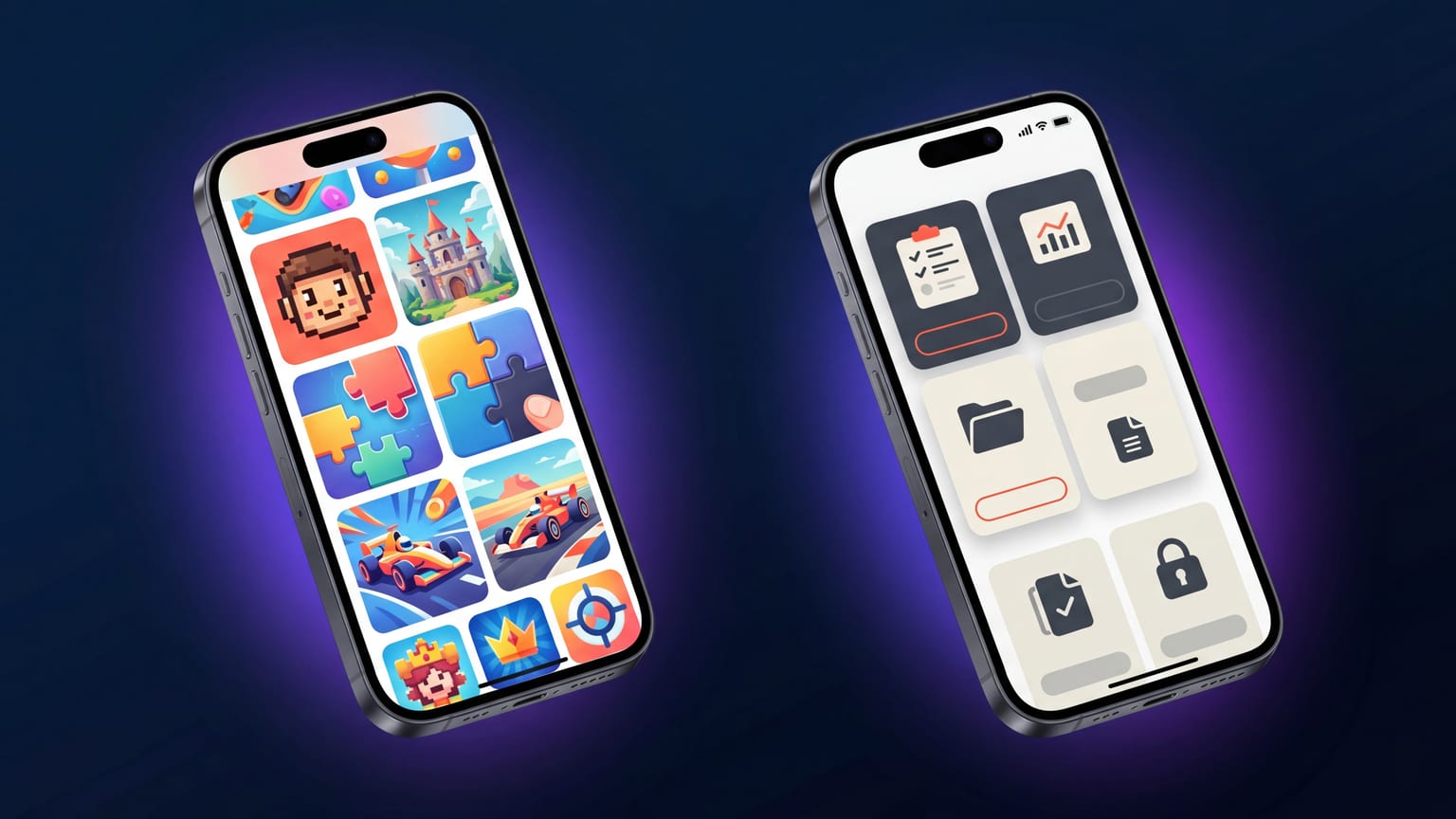
Most ASO advice averages across categories and produces a mushy middle that doesn't quite fit anyone. The divergence between games and utilities is the most extreme, and it's the most useful framing to start from: every other category sits closer to one pole or the other.
What games optimize for
The screenshot job for a game: convey vibe, action, and "you will enjoy playing this" within 300ms of a thumbnail glance. Players aren't reading captions; they're feeling the screenshot.
What works:
- Action shots over UI shots. The character mid-jump beats the inventory screen. The boss fight beats the menu.
- Atmosphere through lighting and color. Dark, moody, vibrant, saturated. The carousel reads as a mini-trailer, not a feature tour.
- Caption-light or caption-free. Many top games run carousels with one-word captions or no captions at all. The screenshot itself does the selling.
- Bezel-less / full-bleed. Skip the device frame. The art is the asset.
- Strong typography for hero word. If you do use text, make it big and bold like a movie poster, not informational like a feature list.
What utilities optimize for
The screenshot job for a utility: convey what the app does, that it's clean and trustworthy, and that the user will be productive in 30 seconds. Users skim captions to qualify the app.
What works:
- Clear UI shots. Show the actual interface. Skip stylized renders.
- Captions that describe features specifically. "Track your spending in real time" beats "Manage your money". Concrete verbs beat brand promises.
- Restrained palettes. 2-3 colors. Lots of white space.
- Device frames present and consistent. The frame signals "this is a real phone interface, not marketing fluff".
- Panel order matters. Lead with the feature that establishes the value proposition; panel 2 is the second-most-important feature; panels 3-5 are differentiators.
What advice translates poorly between them
These are the cross-pollination failures we see most often:
- "Use a device frame around every screenshot." True for utilities. Hurts games — the frame breaks immersion and steals attention from the art.
- "Captions must describe features specifically." True for utilities. Counterproductive for games where the caption should evoke a feeling, not enumerate mechanics.
- "Keep palette restrained." True for utilities. Wrong for games where saturation and dynamic range carry vibe.
- "Dark mode always wins." True-ish for games, frequently wrong for utilities outside specific categories. See dark vs light.
- "Panel 1 should show the main feature." True for utilities. For games, panel 1 should show the most visceral moment — which is rarely the "main feature".
Where the in-between categories sit
Most apps aren't pure games or pure utilities. Rough heuristic:
- Lean game-side: games, music apps, photo editors, AI art, dating, social (TikTok/Instagram/BeReal), entertainment streaming.
- Lean utility-side: productivity, finance, education, business, developer tools, health tracking, navigation.
- Genuine middle: wellness/meditation, fitness, journaling, lifestyle. These categories support either approach; brand position drives the choice.
The hybrid mistake
Apps in the middle often try to do both. Half the panels are atmospheric mood pieces, half are feature-list-style utility shots. This rarely works — the carousel reads as confused. Pick a lane and commit. If your app's core value is "calm and beautiful experience", lean game-side and accept that some users won't qualify the features from the screenshots. If the core value is "powerful tool for X", lean utility-side and accept that the atmospheric magic is best delivered post-install.
How to figure out which side your app is on
Three questions:
- Will users tap install based on a feeling, or based on understanding what the app does?
- Will they remember your app two days later because of vibe or because of utility?
- If they tell a friend, do they describe the experience or the function?
If the answers are feeling / vibe / experience — lean game-side. If they're understanding / function — lean utility-side.
What to do this week
- Honestly classify your app: game-side, utility-side, or genuine middle.
- Look at the top 10 apps in your category. Do they cluster around one approach? That's your category convention.
- Audit your current carousel against the conventions for your side. Where are you doing the wrong thing for your category?
- Make one bold revision in the direction of your category convention. Test it.