
Designing a Google Play feature graphic that converts
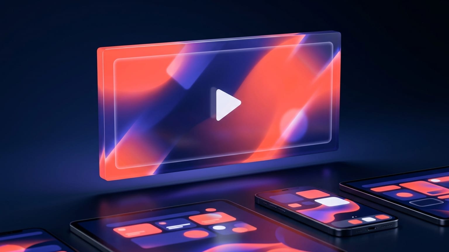
A Play listing gives you one wide banner above everything else. On phone browsers and inside the Play app it runs across the full width before the screenshots, before the description, often before the fold. It is the piece most people see and the piece most developers export from a template without a second thought — which is exactly why a considered one stands out.
This is the design and policy half of the story. The exact dimensions, file format, and where the graphic appears are covered in the companion post; the one-line recap: it must be 1024 x 500 px, saved as JPEG or 24-bit PNG with no alpha channel. Play rejects anything off by a pixel and renders transparency as black. Everything below assumes you already have that canvas and want it to earn the tap.
Say one thing
A feature graphic is not a poster to cram with features. At the size it renders — often a few hundred pixels wide on a phone — you get one idea across, or none. Pick the single reason someone installs your app and build the whole frame around it. A meditation app shows calm, not a feature list. A budgeting app shows a clean number going up, not five icons.
The fastest way to test this: shrink the graphic to thumbnail size and glance at it for one second. If you can name the app's category and its main promise, it works. If your eye has to hunt, there is too much on it.
Mind the play-button safe zone
If you attach a promo video to your listing, Play overlays a play button on the feature graphic so people can tap it to watch. That button lands in the middle of the banner, and the graphic can be framed or cropped differently across surfaces and devices. Two consequences for layout:
- Keep the logo and any text out of the exact center. A play button sitting on top of your wordmark reads as a mistake. Bias the important elements off-center — left third or lower band — so the overlay never collides with them.
- Give the edges breathing room. Don't push type or your logo to the borders. If a surface crops the frame, edge content is the first thing to go. Treat the outer margin as bleed, not usable space.
Even if you have no video today, design as though the play button could appear. It keeps your options open and it is simply a more robust composition.
The lines Play won't let you cross
Google Play's content quality rules treat store graphics as editorial, not advertising. The feature graphic (and your title and short description) must not carry promotional or performance claims. Trip one of these and the submission gets flagged or rejected. The banned categories:
- Performance and ranking claims — "Best," "#1," "Top," "App of the Year," "Popular," "Best of Play."
- Awards, accolades, and testimonials — trophy badges, "As seen in," pull-quotes, star ratings, five-star imagery.
- Download or user counts — "1M+ downloads," "Join a million users."
- Price and promotions — "Free," "50% off," "Sale," "Limited time," "$50 cash back."
- Calls to action — "Download now," "Install now," "Play now," "Try now."
- Play badges and store elements — the "Get it on Google Play" badge or anything resembling a Play UI control, plus fake buttons, toggles, or tap targets baked into the art.
The reframe that keeps you safe: describe what the app is, not how it ranks or what it costs. "Track every subscription in one place" is fine. "The #1 subscription tracker — free!" is two violations in one line.
Make it legible where it actually renders
Design at 1024 x 500, but judge at thumbnail. The failures that only show up when the banner shrinks:
- Low contrast. Pale text on a busy photo disappears the moment it is scaled down. Put type on a solid or gently graded field, and hold a strong value gap between text and background.
- Type that is too small or too fine. Thin weights and long sentences turn to mush. If you use words at all, keep them to a few large, heavy ones.
- Detail that only reads at full size. Fine UI, tiny product shots, and dense patterns all collapse. Favor bold shapes and a clear focal point.
And a specific trap: don't waste the banner repeating your app name. Your title already sits right beside it in the listing. Spending the graphic's headline on text the user can read two centimeters away is a wasted message. Show the benefit or the product instead.
Match the rest of the listing
The feature graphic is not a standalone artwork — it is the top of a set. The icon sits below it, the screenshots below that. When the color, type, and mood carry straight through from banner to icon to screenshots, the listing feels like one product made by people who care. When the feature graphic is a stock gradient that shares nothing with the screenshots, it reads as an afterthought and quietly undercuts trust.
Pull your palette from the icon or the app's real UI. Reuse the same accent color your screenshots use for captions. Keep one typeface family across all of it. Consistency here is not decoration; it is the signal that the whole listing was designed on purpose.
Where Mokbi fits
Mokbi designs the 1024 x 500 feature graphic alongside your screenshot set, so the banner, the panels, and the captions share one palette, one typeface, and one message out of the box — no separate tool, no color-matching by hand. It exports to the exact spec (JPEG or 24-bit PNG, no alpha), keeps the important elements clear of the center and edges, and localizes the graphic across 50 languages so every market gets a banner that fits, not a cropped English one.
You still make the call on the message and the art direction. The tool just makes the whole listing — feature graphic included — look like it belongs together.