
Google Play Feature Graphic: the 1024 x 500 spec
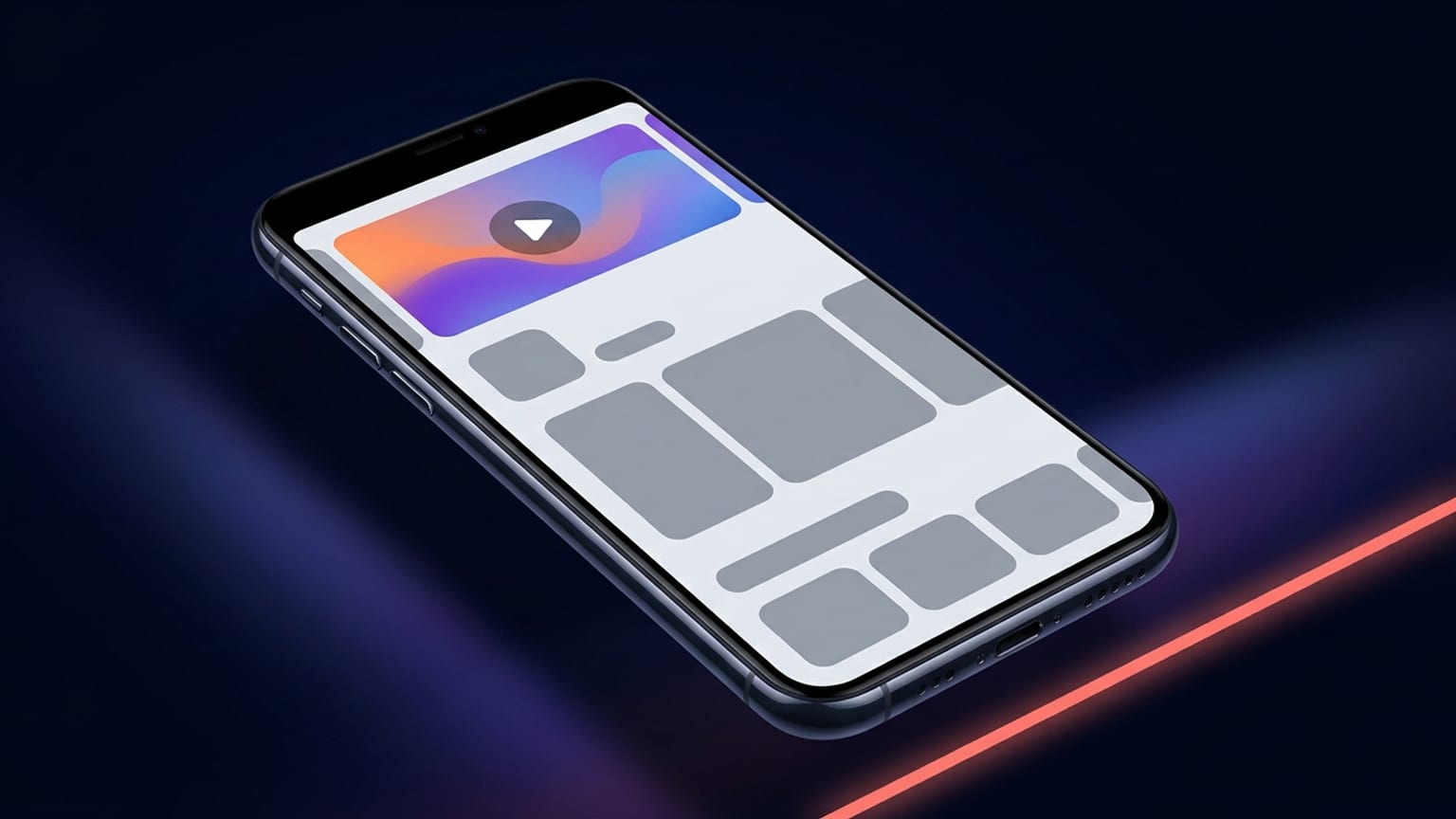
The feature graphic is the single most-overlooked asset in a Google Play listing. Everyone sweats the screenshots and forgets the wide banner sitting above them — even though it's the first image many users see, and the one Google reuses across promotional surfaces. It's also one of the few Play assets with a hard requirement: without a valid feature graphic, Google won't show your promo video and won't feature your app in several merchandising slots.
This is the exact spec, where the image actually appears, the safe zone you have to design around, and the practical rules that keep it legible.
The exact spec
Straight from the Google Play Console help. There is no ambiguity here, so match it exactly:
- Dimensions: exactly 1024 x 500 pixels. Not a range, not "at least" — that precise size.
- File format: JPEG or 24-bit PNG.
- Transparency: no alpha channel. The Console help literally says "24-bit PNG (no alpha)". A PNG exported with transparency will be rejected — flatten it onto a solid background first.
- Aspect ratio: the 1024 x 500 size works out to roughly 2.048:1 — a wide, short landscape banner. Worth remembering when you sketch the layout.
- File size: the Console help doesn't publish a hard cap for this asset; 15 MB is the figure commonly cited, but in practice a well-compressed JPEG lands well under 1 MB. Keep it small for fast listing loads.
Note the no-alpha rule specifically. It's the most common reason a feature graphic upload bounces. Design tools happily export transparent PNGs by default; Google won't take one for this slot. If your editor offers a "flatten" or "background color" option, use it.
Where the feature graphic actually appears
This isn't a decorative extra — Google reuses the image in several places, which is exactly why the safe zone matters:
- Top of your store listing. On the app's Play Store page it's the wide banner above your screenshots and description — the header that frames the whole listing.
- Cover image for your promo video. If you've linked a YouTube promo video, the feature graphic is the video's poster frame. Users tap the play button that overlays it to start the video.
- Promotional and featured placements. Google pulls the feature graphic into large-format collections — curated app lists and recommended-game groups shown with feature graphics. These are the merchandising surfaces you can't manually control, so the image has to read well out of context.
Because the same image does triple duty — listing header, video cover, and featured banner — you can't tune it for just one. It has to survive all three. That's the constraint the rest of the design follows from.
The play-button safe zone
Here's the trap that catches careful designers. The moment you attach a promo video, Google renders a play button on top of the feature graphic, roughly centered. Any logo, headline, or critical detail you parked in the middle is now sitting behind a big circular button.
Google's own guidance: keep prominent visuals and the focal point toward the center, but keep logos and app names out of the cutoff zones at the edges that get cropped depending on the device's UI format. Reconciling those two:
- Center: reserve it for the play button. Don't place text or a logo dead-center if you run a promo video, or it'll be obscured.
- Edges: the outer band on each side can be cropped on some layouts. Don't push anything load-bearing into the far corners.
- The sweet spot: a horizontal band offset from dead-center — think a logo lower-left or a headline left-of-center, with breathing room from every edge. That keeps it clear of both the play button and the crop zones.
If you're not using a promo video, you have the center back and more freedom — but design as if the play button could appear anyway. You may add a video later, and you don't want to redo the graphic when you do.
Why it matters more than it looks
Three concrete reasons the feature graphic earns real attention:
- It gates your promo video. No valid feature graphic, no video cover — so Google won't show your video at all. If you went to the trouble of producing a trailer, this banner is what unlocks it.
- It gates featuring. Several of Google's curated and recommended placements require a feature graphic. Skip it and you're invisible in those slots regardless of how good your app is.
- It's prime first-impression real estate. It's wide, it's at the top, and it's the one fully-controlled brand surface on the listing. A blank or sloppy banner reads as a low-effort app before anyone scrolls to your screenshots.
Concrete design guidance
The hard rule is the spec. Everything below is the difference between a graphic that converts and one that just fills the slot:
- One idea, big. 1024 x 500 is small once it's scaled into a collection thumbnail. One clear message and one focal element beat a cluttered montage. If you can't read it at a glance, simplify.
- Legible at small size. Preview it shrunk to roughly a third of full size — that's closer to how it appears in lists. Body-copy-sized text vanishes; use few words, large.
- Keep critical content off the edges. No logo, app name, or key text in the outer band or corners — those crop. Pad generously.
- Avoid pure white and dark-gray backgrounds. Google notes these can blend into the store's own background. Use vibrant, branded color so the banner has a defined edge.
- Match your app icon's palette. Consistency between the icon and the feature graphic makes the listing feel like one coherent brand, not assets stitched together.
- Skip badges and claims. Don't bake in "Editor's Choice", star ratings, prices, or superlatives like "Best" or "Free". Google's content rules disallow promotional badges and performance claims in this image.
- Plan around the play button. Covered above, but it's the rule people forget: if a video is attached, the center is spoken for.
Why most screenshot tools ignore the feature graphic
Open almost any App Store / Play screenshot tool and you'll find phone-frame templates, caption layouts, and device mockups — all built around the 9:16-ish portrait screenshot shape. The feature graphic is a different beast: a wide 1024 x 500 landscape banner with its own safe zone and its own no-alpha rule. Because it doesn't fit the portrait-screenshot mold, a lot of tools simply leave it out. That's the gap that sends people to a separate banner maker or straight into Figma just for this one asset.
Where Mokbi fits
Mokbi is a browser tool for designing and localizing your store assets — device frames, captions, one-click AI translation into 50 languages, batch export. Because it's a free-form canvas rather than a fixed phone-frame template, you can set a 1024 x 500 artboard, design the feature graphic with your branded background and centered focal point, and export a flattened PNG or JPEG with no alpha — the exact format Google wants. You design and preview for free; a subscription (Solo €29.99/mo or Studio €49.99/mo) unlocks export and publishing. To be straight with you: it does not capture your source screenshots or generate the banner artwork for you — you bring the imagery and Mokbi handles the composition, the localization, and the correctly-sized export.
Quick recap
- 1024 x 500 px, exactly. JPEG or 24-bit PNG, no alpha channel.
- It's the listing header and your video's cover. Plus featured placements you don't control.
- Center is for the play button. Edges crop. Keep logos and text in the offset band between them.
- Legible small, vibrant, on-brand, no badges or claims. One idea, big.