
Play Store vs App Store screenshot differences
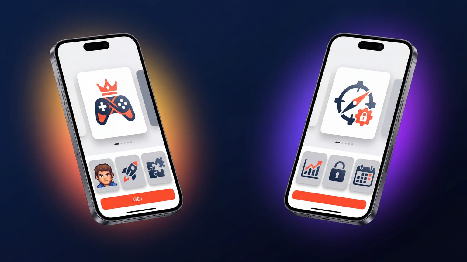
The temptation when shipping cross-platform is to design one screenshot set and use it on both stores. It works — both stores accept similar dimensions — but it leaves conversion on the table because the stores show screenshots differently and reward different design choices.
Required count
App Store: 3-10 screenshots per device class per locale. Apple recommends 3-5.
Play Store: 2-8 screenshots per locale. Google recommends 4-8.
If you ship 5 panels on App Store and 5 on Play Store, you're fine on both. The key difference: the Play Store ranks the first 2 panels more heavily in its previews, while App Store emphasizes the first 3. Lead with your strongest 2 on Play Store; lead with your strongest 3 on App Store.
Dimensions and orientation
App Store (2026 requirements):
- iPhone 6.9": 1320 × 2868 (required for new submissions)
- iPad 13": 2064 × 2752 (required if app supports iPad)
- Specific pixel dimensions per class; Apple rejects mismatched uploads.
Play Store:
- 16:9 or 9:16 aspect ratio, min 320px shortest side, max 3840px longest side.
- One set per device type (Phone / 7-inch tablet / 10-inch tablet / TV / Wear).
- No exact pixel requirement — any size within the range works.
Play Store is more flexible on dimensions, but it has one hard rule people miss: the long side can be at most twice the short side. That rules out nearly every Android handset's own screen resolution — a Pixel 8 Pro is 1344 × 2992, or 2.23:1, and Play rejects it. Play has no per-device sizes at all, so don't chase one: export 1512 × 2688, which is exactly 9:16 and also the ratio Google asks for if you want to be eligible for its recommendation slots.
How the stores render screenshots inline
This is the most under-appreciated difference. The stores show your screenshots inline in different contexts:
- App Store search results: Shows 1-3 screenshots inline below each result. Captions are visible. The screenshot strip is one of the primary tap-through signals.
- Play Store search results: Shows the app icon + 3-4 lines of description, NOT the screenshots. Screenshots only appear once the user taps to the listing.
This means App Store screenshots have to optimize for both search-list tap-through and product-page conversion. Play Store screenshots only need to optimize for product-page conversion — the search-list battle is fought through the icon and short description.
Practical implication: Play Store can afford a "slower" first panel that takes a second to read, because users have already qualified the app by the time they see it. App Store needs panel 1 and 2 to do the heavy lifting in search results before users tap through.
Feature graphic (Play Store only)
Google requires a feature graphic at 1024 × 500. It's not a screenshot — it's a banner image shown at the top of the Play Store listing and in some featured slots. App Store has no equivalent.
Don't skip the feature graphic. A blank or weak feature graphic hurts conversion meaningfully on Play Store, more than a weak panel 5 would. Treat it as one of the most important assets.
Localization
Apple supports 50 App Store locales. Each gets its own screenshot set if you choose to localize. Apple's recommended workflow: same visual design across locales, translated captions.
Google supports ~80 Play Store locales. Same workflow: same design, translated captions per locale. The total localization burden is higher on Play Store because there are more locales.
Pragmatic split: localize iOS and Android in parallel for your top 5-10 locales. Below that tier, only localize for whichever store has more install volume for your app.
Content rules differ
- App Store: stricter on third-party trademarks, pricing claims, and marketing graphics that don't show app UI. See rejection reasons.
- Play Store: more permissive on marketing graphics — you can mix screenshot content with promotional imagery more freely. But Google enforces stricter rules on misleading content: if your screenshot shows a feature, the app must actually do that.
In practice, designing for App Store rules gets you in compliance with Play Store rules too, with one exception: Play Store accepts "lifestyle" panels (e.g., a photo of someone using the app) more readily than App Store. If you have those panels, use them on Play Store only.
The cross-platform workflow that works
- Design the App Store carousel first. Stricter rules mean the design is portable.
- Adapt for Play Store: drop or replace panels Apple would reject, design the feature graphic, consider adding 1-2 panels Google's looser rules permit.
- Localize each store separately. Don't try to share locale sets across stores; the panel counts and aspect ratios are different enough that it's not worth the abstraction.
- Keep visual identity consistent. Same palette, same caption tone, same device-frame style. Users who see you on both stores should immediately recognize it as the same app.