
iPad vs iPhone screenshot strategy
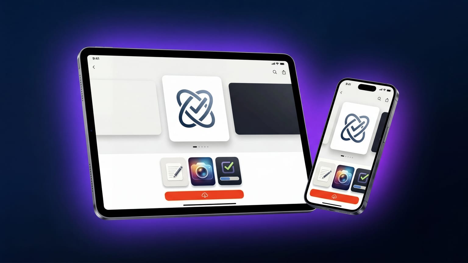
Apple requires at least one iPad screenshot if your app supports iPad. Many apps technically support iPad but only ship iPhone screenshots — Apple auto-generates iPad placeholders from the iPhone uploads, which look bad and signal "doesn't really support iPad" to anyone browsing the iPad App Store. The cost of dedicated iPad screenshots is moderate; the cost of skipping them depends on how much install volume your app expects from iPad.
The honest decision tree
Three buckets:
- iPad is a meaningfully different product. Multi-pane layouts, Apple Pencil features, sidebar navigation that only exists on iPad, drag-and-drop integrations. Design iPad screenshots from scratch. This is most productivity apps, most creative tools, most note apps.
- iPad is the same UI, just bigger. Single-column layouts that scale up. Most games, most consumer apps that don't have iPad-specific features, most chat / social. Reuse the iPhone carousel, swap the device frame, redo captions in landscape if your app rotates.
- iPad isn't really supported. The app technically launches but the UX is bad. Honest answer: deprecate iPad support before shipping screenshots. Bad iPad screenshots hurt the iPhone listing too because they show up in App Store search filters.
What Apple actually requires
As of 2026, the iPad requirement is one screenshot set at 13" (2064 × 2752). Apple auto-scales to 12.9", 11", 10.5", and older classes. You can supply native sizes for each class if you care about quality at every iPad size, but it's optional.
Orientation: iPad accepts both portrait and landscape. Apple uses whichever you upload. Most apps that genuinely shine on iPad use landscape because it shows off multi-pane layouts. Apps that don't have iPad-specific features should stick with portrait to keep messaging consistent with iPhone.
The "reuse iPhone, redo carefully" path
Most apps fall in bucket 2. The cheap path is:
- Take the iPhone carousel design as-is.
- Swap the iPhone frame for an iPad frame at 13" dimensions.
- Resize the screenshot inside the frame (most generators handle this).
- Rewrite captions if needed — iPad captions can be longer because the canvas is bigger. Don't just stretch the iPhone caption text; that looks lazy.
- Reconsider the panel order. iPad users browse differently — many land on the iPad App Store specifically looking for iPad-optimized apps. Lead with whatever signals "this is a real iPad app", not your iPhone-style "main feature first" panel.
This typically takes 30-60 minutes per locale once the iPhone version is shipped. Not a wholesale redesign; not a copy-paste either.
The "iPad-first" path
For bucket 1 (iPad is meaningfully different), invest. Specifically:
- Show multi-pane layouts. iPad's biggest differentiator is screen real estate; use it.
- Show iPad-specific features early. If you have Apple Pencil support, panel 1 or 2.
- Use landscape if your app shines in landscape. The iPad App Store renders landscape screenshots taller and more prominently than portrait.
- Don't waste a panel on "available on iPad" — that's metadata, not screenshot content.
Locale: same logic, scaled
If you localize iPhone screenshots into 50 languages, do you do the same for iPad? Honest answer: only for your top install-volume locales. Most apps see lower install volume on iPad than iPhone, so the ROI on a full iPad locale spread is lower. Cover your top 5-10 locales for iPad; leave the rest using your default locale's iPad screenshots.
The "no iPad screenshots" case
If you genuinely don't support iPad well and your install volume from iPad is tiny, deprecate iPad support in App Store Connect and skip iPad screenshots entirely. The penalty is losing iPad discovery, but you also stop disappointing users who install on iPad and find a stretched iPhone app.
This is a real strategic decision, not laziness. Some apps are stronger by being iPhone-only and marketing themselves clearly as such.
The most common mistake
Uploading the iPhone carousel into the iPad slot without changing anything. Apple accepts it — but the iPhone frame looks tiny on iPad's larger canvas, the screenshots feel hollow, and anyone browsing the iPad App Store knows immediately that the developer didn't care. iPad users are pickier than iPhone users about iPad-native apps. A clearly thoughtless iPad listing signals an iPhone-only app dressed up.
What to do this week
- Decide which bucket your app is in. Be honest.
- If bucket 2, do the 30-60 minute reuse pass for one locale. Ship it and measure install volume from iPad before investing more.
- If bucket 1, design iPad-first for your top 3-5 locales. Apply the iPhone learnings on panel order and caption tone.
- If bucket 3, deprecate iPad support in App Store Connect rather than shipping bad iPad screenshots.